background
#f6f1e4Warm cream. The ground state of every page.
These are the rules for how Aloha looks and sounds. Our team follows them; partners, press and customers are welcome to use the identity as long as they do too.
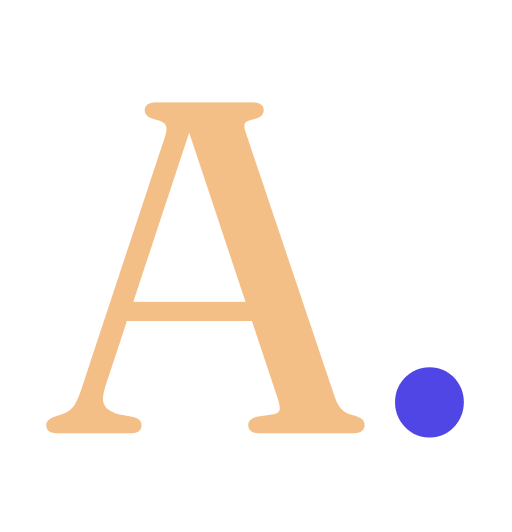
The wordmark
The period is the brand. A quiet mark at the end of a confident word. Do not remove it. Do not shift its colour.
The mark
Favicons, app icons, avatars, OG cards. The standalone mark shares the wordmark's rules — keep the period indigo and give it breathing room.

Asset files
Do
Don't
Colour
Warm cream ground, warm ink foreground, a single peach family for warmth, indigo for calls to action only. No grays, no pure black, no secondary accent colour.
Surface
background
#f6f1e4Warm cream. The ground state of every page.
background-elev
#fffdf6Elevated surfaces — cards on cream.
foreground / ink
#1a1612Warm ink. Body text and ink-inverted cards.
Peach (the only accent family)
peach-100
#fbe6cfSoftest — page backgrounds, quiet callouts.
peach-200
#f9d5aeCards, hero backgrounds.
peach-300
#f4bf87Active states, emphasis.
peach-400
#ed9f57Loudest — use rarely, sparingly.
Primary (indigo — CTAs only)
primary
#4f46e5Buttons, links, emphasis italic.
primary-soft
#ecebfcTinted backgrounds, secondary cards.
primary-deep
#2e2a85Hover / pressed state for primary.
Tokens are exported as CSS variables in app/globals.css and mapped to Tailwind via @theme inline.
Typography
A display serif paired with a clean sans. Fraunces carries the editorial personality — headlines, quotes, italics — while Outfit handles body, UI, and mono-free data.
Fraunces · display
Aa
A monday note.
a soft afternoon.
400 regular · 500 medium · · opsz 36
Outfit · sans
Aa
Aloha is a social media tool that helps creators and small teams schedule posts across eight networks without losing their voice to it.
400 regular · 500 medium · 600 semibold
Both licensed open source — Fraunces via SIL Open Font License, Outfit via SIL Open Font License. Self-hosted through next/font; no external CDNs.
Voice
We write like a careful editor, not a growth marketer. No exclamations, no emoji in default copy, no “game- changing” anything. A short truth beats a polished over-claim.
We say
We don't say
Motion
Animations are confirmations, not entertainment. Short durations (150–400ms), eased curves, and a strong bias toward CSS-only effects.
Pencil link
350ms · cubic-bezier(0.2, 0.8, 0.2, 1)
Float
float-soft · 6s ease · hero cards, mock UI panels
Entrance ping
animate-ping · live indicators only
Respect prefers-reduced-motion. Every animated element in the codebase disables itself when the user has the OS setting on.